How to make your design system accessible
In our previous post on Developing a Design System, I talked about how a design system will assist you in bringing consistency to your growing product. However, what good is having a design system if an application isn’t accessible to a diverse audience?
According to the World Bank Organization report one billion people, or 15% of the world’s population, experience some form of disability, and disability prevalence is higher for developing countries. One-fifth of the estimated global total, or between 110 million and 190 million people, experience significant disabilities.
By creating web application accessibility, you are ensuring that all potential users can have a decent user experience with easily accessible information.
Presenting information through multiple sensory channels, such as keyboard-based control and voice-based navigation, allows for additional methods of site navigation and interactivity beyond the point and click interface. This approach allows disabled users to access the same information as nondisabled users.
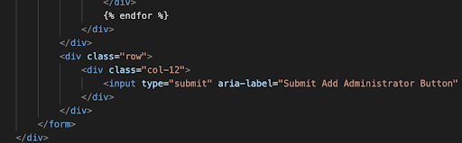
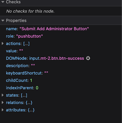
In this example, we will be showing you how a button object can be made more accessible by using an aria-label. These are especially useful when applied to icon-based buttons (without text) or images.
Using aria-label
An aria-label is an attribute that can be used to provide an accessible label to an element. The aria-label takes a string of text as a value, and that string will be used as the accessible name for the element it is used on. This allows for a sight-impaired to access screen readers or dictation software.
When aria-label is used on a button, the contents of the attribute will override the contents inside the button as the accessible name. This means that, if you have an icon or even other text content inside your <button>, that content will no longer be announced as part of the button’s name. VoiceOver will announce Menu, Button, and the dev tools will now indicate that the accessible name of the button was provided by the aria-label attribute. You mustn’t want to have an accessible label that is different from the visual text label, you always make sure the visual text matches what screen reader users will hear; this is a WCAG 2.1 requirement. It is worth noting that not all screen reader users are blind, so you’ll want to make sure that what they see matches what the screen reader is announcing to them.
This is but one example where adding an extra bit of code can improve accessibility but there is a lot to learn when developing your web application. Disabilities such as color-blindness for example can be easily forgotten by designers and developers since a majority of them aren’t color blind.
To guide you in these endeavors, here’s a few resources and tools that can be used alongside some of the most popular tools for UI design and development
Figma
Accessibility plugin https://www.figma.com/community/plugin/931280467863251825/Adee—Comprehensive-Accessibility-Testing-Tool
Storybook
Accessibility add-on panel https://storybook.js.org/blog/accessibility-testing-with-storybook/
More resources
- A11y Project – https://www.a11yproject.com/
- W3C resources for developers – https://www.w3.org/WAI/roles/developers/
- Web Accessibility Toolkit – https://accessibility.arl.org/news-reports/external-resources/
